
What is a CSS Framework? - Explanation & Meaning
CSS frameworks like Tailwind CSS and Bootstrap speed up UI development with pre-built styles. Choose utility-first or component-based by preference.
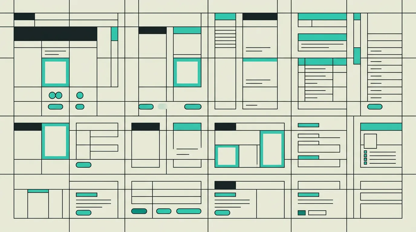
A CSS framework is a pre-built collection of CSS styles, utility classes, and optionally full components that help developers build user interfaces faster and more consistently without writing all styling from scratch. Frameworks provide a standardised foundation for layout, typography, colour, and responsiveness. They range from utility-first systems that offer atomic classes to component-based libraries shipping ready-made UI elements. The choice influences development speed, bundle size, and the degree of design customisation that remains possible.
What is CSS Framework?
A CSS framework is a pre-built collection of CSS styles, utility classes, and optionally full components that help developers build user interfaces faster and more consistently without writing all styling from scratch. Frameworks provide a standardised foundation for layout, typography, colour, and responsiveness. They range from utility-first systems that offer atomic classes to component-based libraries shipping ready-made UI elements. The choice influences development speed, bundle size, and the degree of design customisation that remains possible.
How does CSS Framework work technically?
CSS frameworks generally fall into two main categories. Component-based frameworks like Bootstrap and Bulma ship ready-made UI components: buttons, navigation bars, modals, form fields, and cards with predefined styles and optional JavaScript for interactive behaviour. The advantage is rapid prototyping; the drawback is that the output quickly looks recognisable as a "Bootstrap site" unless significant customisation is applied. Utility-first frameworks like Tailwind CSS follow a fundamentally different philosophy. They provide atomic classes such as flex, pt-4, text-center, and bg-blue-500 that developers compose by adding them directly to HTML markup. Tailwind CSS v4 compiles only the classes actually used thanks to its oxide engine, keeping the resulting CSS bundle minimal regardless of project size. Configuration through the CSS-based config system allows full customisation of colours, spacing, breakpoints, font families, and plugins. This makes any design achievable without the constraints of predefined component styles. CSS-in-JS solutions like Styled Components and Emotion offer a third approach, writing styles as JavaScript objects or template literals that produce automatically scoped class names. The benefit is complete co-location of styles with the component; the cost is runtime overhead and a larger JavaScript bundle. CSS Modules provide local scope without runtime penalties by hashing class names at build time. PostCSS plugins process modern CSS syntax, add vendor prefixes, and optimise output. PandaCSS and StyleX represent the latest generation, combining type-safe styling with zero-runtime output so the advantages of CSS-in-JS are available without the performance costs. The framework you choose affects not just development speed and bundle size but also the learning curve for the team, the degree of design customisability, and the long-term maintainability of the codebase. Open Props is a growing alternative that provides design tokens as CSS custom properties, offering a framework-agnostic foundation without prescribing a class naming convention. Lightning CSS, built in Rust, delivers extremely fast CSS transformation and minification that integrates seamlessly with modern bundlers like Vite and Turbopack.
How does MG Software apply CSS Framework in practice?
MG Software standardises on Tailwind CSS for every project because of the combination of flexibility, excellent performance, and high development velocity. For each engagement we configure Tailwind with custom design tokens that align seamlessly with the client's brand identity: primary and secondary colours, typography scale, spacing system, and breakpoints are all defined centrally. Combined with Radix UI or shadcn/ui, we build accessible, visually polished interfaces that match any design without sacrificing performance. Our developers use Tailwind Merge and clsx for conditional class composition, and we enforce strict Biome rules to maintain consistent class ordering. Thanks to this approach we write virtually no custom CSS, and the styling of any project is fully predictable for every team member. When a project requires animations, we integrate Tailwind with Framer Motion, defining animation presets as shared utilities so transitions remain consistent and performant across every page.
Why does CSS Framework matter?
A CSS framework saves hundreds of hours of development time by providing consistent, tested styles as a starting point. Tailwind CSS eliminates the need to invent a custom CSS architecture and ensures every team member follows the same conventions, which simplifies maintenance and collaboration considerably. New developers become productive faster because they learn the utility classes rather than having to decipher a project-specific CSS structure. The JIT compilation of Tailwind also produces small CSS files that do not burden load times, even for large-scale applications. For organisations managing multiple products, a shared Tailwind theme backed by design tokens forms the bridge between the design system and its real-world implementation in code.
Common mistakes with CSS Framework
A frequent mistake is choosing a CSS framework purely based on popularity without evaluating the specific needs of the project. Bootstrap excels at rapid prototyping but can become restrictive when the design diverges significantly from its default styling. Another pitfall is loading the full framework while only a fraction of its components are used, resulting in unnecessarily large CSS files. With Tailwind CSS, teams sometimes write extremely long class strings in their HTML without abstracting them into reusable components, making the markup difficult to read and maintain. Finally, some teams neglect to synchronise their Tailwind configuration with the design tokens in Figma, creating a gap between design and implementation that widens with every change.
What are some examples of CSS Framework?
- A startup that ships a fully responsive marketing website with dark mode, subtle animations, and a contact form within two weeks using Tailwind CSS and shadcn/ui, without writing a single line of custom CSS.
- An enterprise organisation that deploys Bootstrap for internal tools and dashboards because the pre-built components and extensive documentation make new developers productive within days of joining the project.
- A design agency that builds a bespoke Tailwind theme with tailored colours, typography, and spacing that precisely match their client's brand book, ensuring design and code stay perfectly aligned.
- A SaaS startup that migrates from Styled Components to PandaCSS to reduce its JavaScript bundle by 35KB and improve hydration time while preserving the type-safe developer experience.
- A healthcare platform that configures Tailwind with a custom colour palette meeting WCAG AA contrast ratios by default, so every developer on the team produces accessible interfaces without needing to manually check contrast for each element.
Related terms
Frequently asked questions
We work with this every day
The same expertise you are reading about, we put to work for clients across Europe.
See what we doRelated articles
Responsive Design Explained: How Fluid Layouts Power the Modern Web
Responsive design adapts web pages to any screen size using fluid grids, media queries, and mobile-first CSS. Learn the technical foundations, real-world examples, and best practices.
What Is an API? How Application Programming Interfaces Power Modern Software
APIs enable software applications to communicate through standardized protocols and endpoints, powering everything from payment processing and CRM integrations to real-time data exchange between microservices.
What Is SaaS? Software as a Service Explained for Business Leaders and Teams
SaaS (Software as a Service) delivers applications through the cloud on a subscription basis. No installations, automatic updates, elastic scalability, and secure access from any device make it the dominant software delivery model for modern organizations.
Qwik Alternatives That Ship Production Apps Today
Resumability is promising but the ecosystem is small. Five frameworks that already deliver what Qwik promises for your next production project.