
What are Web Components? - Explanation & Meaning
Web Components create reusable UI elements via Custom Elements and Shadow DOM. They are framework-agnostic and natively supported by all modern browsers.
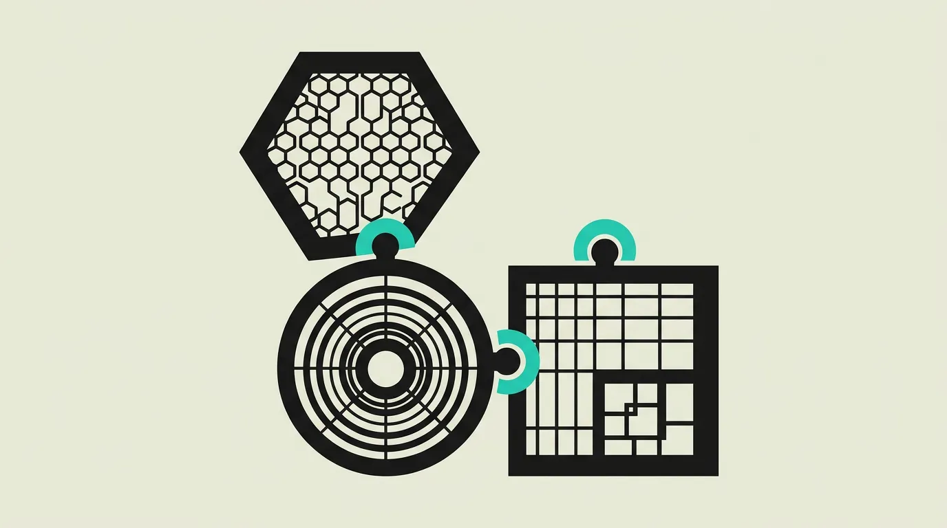
Web Components are a set of browser-native web standards that allow developers to create fully reusable, encapsulated HTML elements that function in any web application regardless of which framework is used. Built on three specifications (Custom Elements, Shadow DOM, and HTML Templates), they enable self-contained components with their own markup, styles, and behavior. Because they are part of the web platform itself rather than a third-party library, Web Components work everywhere modern browsers run and do not require additional runtime dependencies.
What is What are Web Components? - Explanation & Meaning?
Web Components are a set of browser-native web standards that allow developers to create fully reusable, encapsulated HTML elements that function in any web application regardless of which framework is used. Built on three specifications (Custom Elements, Shadow DOM, and HTML Templates), they enable self-contained components with their own markup, styles, and behavior. Because they are part of the web platform itself rather than a third-party library, Web Components work everywhere modern browsers run and do not require additional runtime dependencies.
How does What are Web Components? - Explanation & Meaning work technically?
Web Components consist of three core specifications. Custom Elements allow developers to define new HTML tags with custom behavior via the customElements.define() API and the HTMLElement class. Each custom element goes through a well-defined lifecycle: the constructor runs on creation, connectedCallback fires when the element is added to the DOM, disconnectedCallback fires on removal, and attributeChangedCallback responds to changes in observed attributes. Shadow DOM provides DOM and CSS encapsulation by creating a separate DOM tree isolated from the main document, preventing styles from leaking in either direction. This isolation ensures that component internals remain private and that global styles cannot accidentally break a component's appearance. HTML Templates with <template> and <slot> elements define reusable markup structures that are only rendered when activated. Slots enable content projection, allowing consumers to inject their own markup into predefined locations within the component. Declarative Shadow DOM enables server-side rendering of Web Components by embedding the shadow root directly in HTML via the shadowrootmode attribute, eliminating the flash of unstyled content that occurs when shadow trees are created solely through JavaScript. Libraries like Lit simplify authoring with reactive properties, decorators, and efficient template rendering in under 5 KB of runtime. Stencil takes a compiler approach, generating standard Web Components with lazy loading, automatic polyfills, and framework-specific output targets. The ElementInternals API opens access to form participation, allowing custom elements to behave like native form controls with validation, labels, and form data submission. CSS custom properties and the ::part() pseudo-element provide controlled external styling hooks without breaking encapsulation. Web Components are fully interoperable with frameworks like React, Vue, and Angular, making them the ideal foundation for design systems shared across different technology stacks. Adoption has accelerated as major companies including Adobe, Google, GitHub, and Salesforce ship production design systems built entirely on Web Components.
How does MG Software apply What are Web Components? - Explanation & Meaning in practice?
MG Software uses Web Components when clients need UI elements that work across multiple frameworks and projects without duplication. We build framework-agnostic components with Lit, leveraging its reactive properties and lightweight runtime to create performant, reusable elements. These components are consumed in React applications via wrapper packages and in Vue projects through native custom element support, ensuring a single source of truth for shared UI. Our approach starts with defining design tokens as CSS custom properties, making theming consistent across all consuming applications. For complex form elements, we utilize the ElementInternals API so our custom components participate natively in form submission and validation. We ship components as npm packages with TypeScript declarations, enabling strong typing and autocomplete in any consuming project. This strategy significantly reduces development time for clients with diverse technology stacks and prevents the visual inconsistencies that arise when different teams build the same component independently.
Why does What are Web Components? - Explanation & Meaning matter?
Web Components offer the only browser-native way to create truly framework-agnostic UI elements that work across any JavaScript ecosystem. For organizations operating multiple applications built on different frameworks, whether React, Vue, Angular, or vanilla JavaScript, Web Components ensure visual and behavioral consistency without vendor lock-in or duplication of component code. As frameworks evolve and sometimes fall out of favor, Web Components remain stable because they are part of the web platform specification maintained by browser vendors. This longevity protects the investment in building a component library. Additionally, Shadow DOM encapsulation prevents the cascade conflicts and style collisions that plague large applications with multiple teams contributing CSS. By standardizing on Web Components for shared design system elements, organizations create a durable foundation that survives framework migrations and team reorganizations.
Common mistakes with What are Web Components? - Explanation & Meaning
A frequent mistake is reaching for Web Components when a framework-specific component would suffice. Web Components add value primarily when sharing UI across frameworks or embedding widgets on third-party sites. Using them inside a single React application introduces unnecessary complexity without benefit. Another common error is fighting Shadow DOM encapsulation instead of leveraging it: developers try to pierce the shadow boundary with global styles or JavaScript queries, which defeats the purpose and creates fragile code. Misusing ARIA attributes inside shadow roots is also problematic because screen readers may not correctly associate labels across shadow boundaries unless proper delegation is configured. Teams sometimes neglect the ElementInternals API for form-connected components, resulting in custom inputs that do not participate in native form validation or submission. Finally, forgetting to provide CSS custom properties for theming forces consumers to override styles through brittle hacks.
What are some examples of What are Web Components? - Explanation & Meaning?
- A large enterprise building a Web Component design library with Lit, deployed as an npm package and consumed by their React marketing site, Vue customer portal, and vanilla JavaScript legacy application. By sharing a single component source, the organization eliminates duplicate code across teams and ensures that every product presents a consistent visual identity.
- A SaaS company distributing an embeddable customer review widget as a Web Component. Any website can include it with a simple <review-widget> tag, load the script from a CDN, and display reviews without any framework dependency. The Shadow DOM prevents the host page's styles from interfering with the widget's appearance.
- A design system team offering foundational tokens and base components as Web Components, with automatically generated React and Angular wrappers via Stencil's output targets. Designers update a single Figma library, tokens flow into CSS custom properties, and every framework consumer receives matching component updates through the same release pipeline.
- A media company building an accessible video player as a Web Component with full keyboard support, ARIA attributes, and customizable controls via CSS parts. The player is embedded on partner websites without worrying about style conflicts, and each partner customizes colors and layout through exposed CSS custom properties.
- A financial services firm creating a secure payment form as a Web Component isolated by Shadow DOM. The encapsulated DOM tree prevents external scripts from accessing sensitive form fields, adding a layer of security beyond iframes. The component participates in the host form via ElementInternals, enabling seamless validation and submission.
Related terms
Frequently asked questions
We work with this every day
The same expertise you are reading about, we put to work for clients across Europe.
See what we doRelated articles
What Is React? The Component Library That Powers Modern Web Applications
React is Meta's open-source JavaScript library for building interactive, component-based user interfaces. With the Virtual DOM, hooks, server components, and a thriving ecosystem around Next.js, React is the most widely adopted frontend technology worldwide.
What Is TypeScript? How Static Types Improve JavaScript Development at Scale
TypeScript extends JavaScript with optional static types, catching bugs at compile time and making large codebases far more maintainable. Learn how it works, when to adopt it, and why professional development teams increasingly treat it as the default.
What is Node.js? The Complete Guide to Server-Side JavaScript
Node.js runs JavaScript on the server with an event-driven architecture. From REST APIs to real-time apps: learn how Node.js fits into modern full-stack development with TypeScript and the npm ecosystem.
Qwik Alternatives That Ship Production Apps Today
Resumability is promising but the ecosystem is small. Five frameworks that already deliver what Qwik promises for your next production project.