
Design Systems Explained: Components, Tokens, and Governance
A design system bundles reusable components, design tokens, and guidelines into a single source of truth. Learn how it delivers consistent UI at any scale and accelerates development.
A design system is an organised collection of reusable components, design tokens, patterns, and guidelines that together guarantee visual and functional consistency across every digital product an organisation ships. It serves as the single source of truth for both designers and developers, enabling teams to work independently without the brand experience fragmenting. From colour definitions and typography rules to fully built UI components, a design system codifies the design standard and makes it repeatable at any scale.
What is Design Systems Explained: Components, Tokens, and Governance?
A design system is an organised collection of reusable components, design tokens, patterns, and guidelines that together guarantee visual and functional consistency across every digital product an organisation ships. It serves as the single source of truth for both designers and developers, enabling teams to work independently without the brand experience fragmenting. From colour definitions and typography rules to fully built UI components, a design system codifies the design standard and makes it repeatable at any scale.
How does Design Systems Explained: Components, Tokens, and Governance work technically?
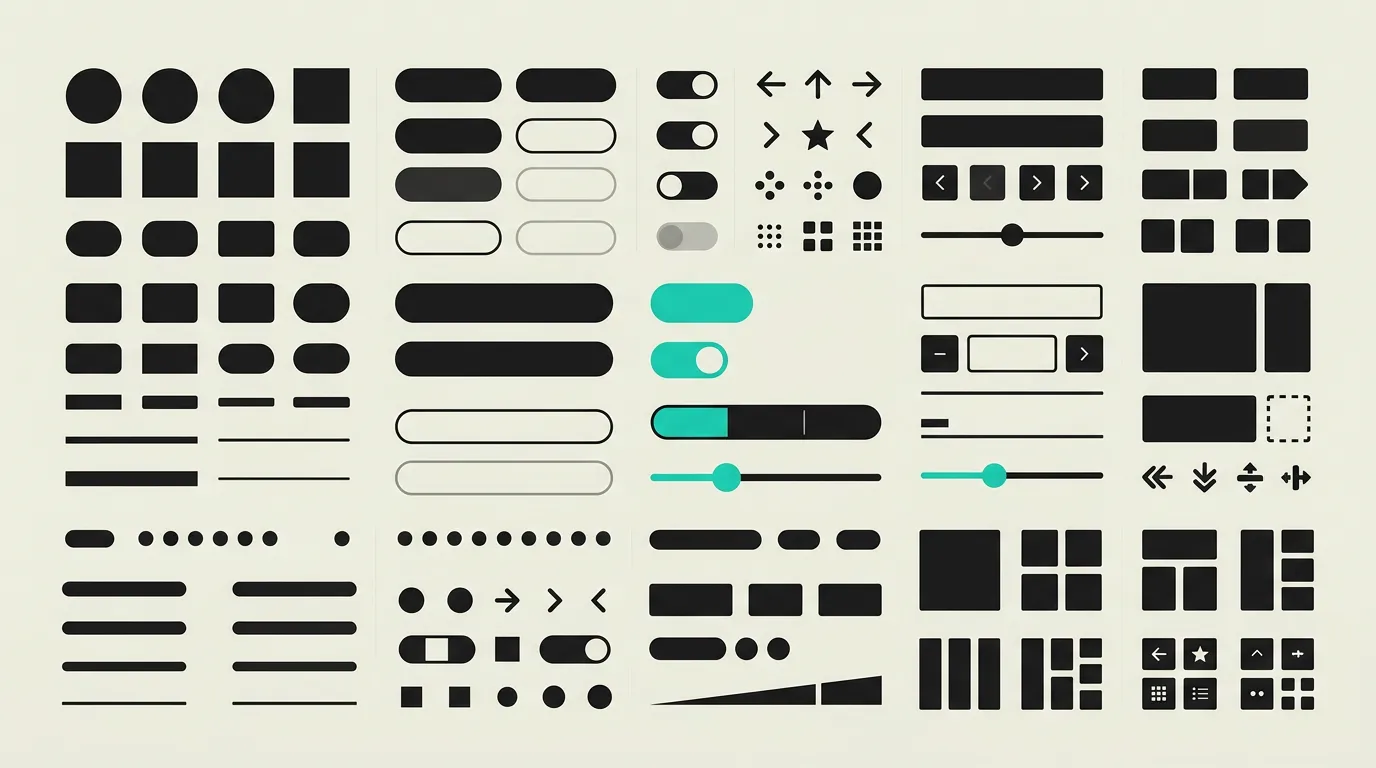
A mature design system is built in distinct layers that reinforce each other. The foundation consists of design tokens: abstract variables for colours, typography, spacing, border-radius, and shadows. These tokens are managed in a central repository and distributed to every platform via tooling such as Style Dictionary or Tokens Studio, producing CSS custom properties, Tailwind configuration, iOS asset catalogues, or Android resource files as needed. On top of the tokens sit component libraries that implement reusable UI elements: buttons, form fields, modals, navigation bars, and more. In Figma, components leverage variants, auto-layout, and component properties so designers can use them flexibly without deviating from the standard. In code, the same components are realised as React, Vue, or Web Components with TypeScript typing, comprehensive props, and built-in accessibility attributes such as ARIA labels and keyboard navigation support. Storybook acts as the living documentation layer. Every component receives stories showcasing all states and variants, controls that let stakeholders adjust parameters in real time, and automated accessibility checks through the a11y addon. Visual regression testing via Chromatic compares component screenshots on every code change and flags unexpected differences automatically. Semantic versioning and structured changelogs ensure that consumers of the system know exactly what each release contains and can upgrade confidently. A governance model with contribution guidelines defines how new components are proposed, reviewed, and accepted into the system, preventing unchecked growth and maintaining quality. Theming through CSS custom properties or token scoping allows the same system to serve multiple brands, which is especially valuable for organisations with sub-brands or white-label products. Finally, a mature design system integrates with the CI/CD pipeline: automated tests, linting, and publishing to a private npm registry guarantee that updates reach all consuming applications reliably and quickly.
How does MG Software apply Design Systems Explained: Components, Tokens, and Governance in practice?
MG Software builds custom design systems for clients who need consistency across multiple products or teams. Every engagement starts with an audit of existing UI patterns and brand guidelines, mapping out duplication and inconsistencies. We design components in Figma using design tokens that translate directly into code. Implementation happens in React with TypeScript, including full accessibility support and unit tests for every component. All components are documented in Storybook so that designers, developers, and product managers alike can explore and use the system. We leverage Chromatic for visual regression testing and publish releases through a private npm registry with semantic versioning. The result is significantly faster development cycles and a unified brand experience, regardless of which team or product is involved.
Why does Design Systems Explained: Components, Tokens, and Governance matter?
A design system drastically accelerates development by enabling reuse of tested, accessible components. Inconsistencies that damage brand perception are eliminated because every team draws from the same set of building blocks. New developers become productive faster since they can work with well-documented components instead of deciphering an entire codebase. The end product looks professional and cohesive regardless of how many teams contribute. Organisations that invest in a design system report shorter development cycles, fewer bugs related to UI inconsistencies, and higher customer satisfaction because the interface feels familiar and predictable across every touchpoint. A design system also lowers the barrier for visual refreshes: updating tokens and component styles centrally propagates changes everywhere, eliminating the need to refactor each application individually. For fast-growing organisations this is a strategic advantage, as it enables visual evolution without months-long refactoring efforts that pull engineering resources away from product development.
Common mistakes with Design Systems Explained: Components, Tokens, and Governance
A frequent mistake is treating a design system as a one-time project rather than a living product that requires ongoing maintenance and governance. Without clear ownership and a process for updates, the system becomes outdated quickly and teams stop trusting it. Another pitfall is attempting to build too many components at once. Starting small with the most commonly used elements and expanding incrementally based on real demand produces better results. Some organisations forget to embed accessibility in the components themselves, forcing every consuming application to reinvent the wheel. Finally, design tokens are often maintained only in Figma without being synchronised to code, causing design and implementation to drift apart over time.
What are some examples of Design Systems Explained: Components, Tokens, and Governance?
- A fintech company that builds a design system containing 120 components in Figma and React, enabling four product teams to ship features independently while maintaining a fully consistent look and feel. Time to market for new features drops by 40% thanks to component reuse.
- A government agency that centrally manages design tokens via Style Dictionary and automatically distributes them to their public website (CSS), mobile app (iOS and Android), and internal tools. A single token change propagates to every platform within minutes.
- A SaaS platform that uses Storybook as living documentation, allowing designers and developers to interactively explore components, run accessibility checks, and select the right variants without having to dig through codebases.
- An insurance company with three sub-brands that uses token scoping and CSS custom properties to serve three visually distinct products from one design system, cutting maintenance effort by 60% compared to maintaining separate codebases.
- A scale-up that publishes its design system as an open-source package, enabling external partners and integration vendors to use the same component library and maintain brand consistency across the entire ecosystem, including third-party integrations and co-branded landing pages.
Related terms
Frequently asked questions
We work with this every day
The same expertise you are reading about, we put to work for clients across Europe.
See what we doRelated articles
What Is an API? How Application Programming Interfaces Power Modern Software
APIs enable software applications to communicate through standardized protocols and endpoints, powering everything from payment processing and CRM integrations to real-time data exchange between microservices.
What Is SaaS? Software as a Service Explained for Business Leaders and Teams
SaaS (Software as a Service) delivers applications through the cloud on a subscription basis. No installations, automatic updates, elastic scalability, and secure access from any device make it the dominant software delivery model for modern organizations.
What Is Cloud Computing? Service Models, Architecture and Business Benefits Explained
Cloud computing replaces costly local servers with flexible, on-demand IT infrastructure delivered through IaaS, PaaS, and SaaS from providers like AWS, Azure, and Google Cloud. Learn how it works and why it matters for your business.
Qwik Alternatives That Ship Production Apps Today
Resumability is promising but the ecosystem is small. Five frameworks that already deliver what Qwik promises for your next production project.