shadcn/ui vs Material UI in 2026: Bundle Size, Customization and Real Build Time Compared
shadcn/ui or MUI for your React app? We rebuilt the same dashboard in both. Final bundle size, time-to-customize, accessibility scores and total cost of ownership measured. Clear pick per project type.
shadcn/ui and Material UI represent two fundamentally different philosophies for component libraries. shadcn/ui gives maximum control and flexibility by placing components as source code in your codebase, making it ideal for custom designs with Tailwind CSS and projects where brand identity is crucial. Material UI offers the most complete package of production-ready components with a proven design system, advanced DataGrid and DatePicker components, and an extensive theme system. Choose shadcn/ui when you want to build a unique design without restrictions. Choose Material UI when you need a consistent, professional interface quickly with advanced enterprise components that are complex to build yourself.
Background
The choice between shadcn/ui and Material UI reflects a broader trend in the React world: the shift from traditional npm-installed component libraries toward a copy-paste model where developers own the source code. shadcn/ui, created by shadcn, has accelerated this trend by making high-quality Radix UI-based components available that you copy into your project and fully customize. Material UI remains the most downloaded React component library with millions of monthly npm installations. Both approaches have clear advantages and the right answer depends on your priorities: maximum control or maximum component offering.
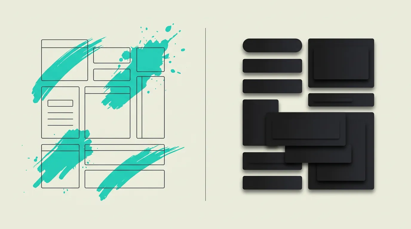
shadcn/ui
Not a traditional component library but a collection of reusable components you copy into your own project. shadcn/ui is built on Radix UI primitives for accessibility and styled with Tailwind CSS for maximum flexibility. Because the source code lives in your project, you have full control over styling, behavior, and customizations. There is no vendor lock-in, no external dependency to track, and no abstraction layer limiting you. In 2026, shadcn/ui has more than 40 components and a growing ecosystem of community extensions and themes.
Material UI
The most popular React component library in the world, based on Google's Material Design system. Material UI (MUI) version 6 provides an extensive set of more than 50 production-ready components, a powerful theme system with CSS variables, and support for both Material Design and fully custom design systems via MUI System. MUI also offers paid components such as DataGrid Pro and DatePicker Pro for enterprise applications with advanced data display and manipulation capabilities.
What are the key differences between shadcn/ui and Material UI?
| Feature | shadcn/ui | Material UI |
|---|---|---|
| Distribution model | Copy-paste where components live in your own codebase and you fully own them | NPM package installed as a dependency with automatic updates via your package manager |
| Styling | Tailwind CSS utility-first with full customizability via classnames and CSS variables | Emotion or Styled-components as runtime CSS-in-JS, with Tailwind option via MUI System |
| Customizability | Complete because you own the source code and can modify everything directly without limits | Via theme object and sx prop, but the underlying component structure is determined by MUI |
| Component offering | Growing with more than 40 components and active community extensions increasing every week | Very extensive with 50+ components including complex DataGrid, DatePicker, and TreeView widgets |
| Bundle size | Minimal because only used components are included without any extra runtime overhead at all | Larger due to Emotion runtime, Material Design CSS, and extra abstraction layers that ship |
| Accessibility | Excellent thanks to Radix UI primitives specifically designed for complete WAI-ARIA compliance | Good with Material Design guidelines that follow accessibility standards but offer less granular control |
| Design flexibility | Unlimited because you modify the full source code and can change every visual aspect freely | Limited to theme variables and sx prop, deviating from Material Design requires more effort |
| Maintenance | You manage updates yourself, giving more control but also more responsibility for changes | Updates via npm with changelogs and migration guides, less control but less maintenance work |
When to choose which?
Choose shadcn/ui when...
Choose shadcn/ui when you want full control over every component without abstraction layers or vendor lock-in. shadcn/ui is ideal for projects with Tailwind CSS, custom design systems, and situations where you want to precisely tune the appearance of every button, input, and dialog to your brand identity. The combination with Radix UI primitives guarantees excellent accessibility as a foundation. The smaller bundle size without runtime CSS-in-JS is a bonus for performance.
Choose Material UI when...
Choose Material UI when you need a professional interface quickly with a consistent, recognizable design and advanced components out of the box. Material UI offers the broadest component selection with DataGrid Pro, DatePicker, TreeView, and Autocomplete that are complex and time-consuming to build yourself. It is ideal for admin dashboards, internal tools, and enterprise applications where the Material Design aesthetic fits and development speed is the priority.
What is the verdict on shadcn/ui vs Material UI?
shadcn/ui and Material UI represent two fundamentally different philosophies for component libraries. shadcn/ui gives maximum control and flexibility by placing components as source code in your codebase, making it ideal for custom designs with Tailwind CSS and projects where brand identity is crucial. Material UI offers the most complete package of production-ready components with a proven design system, advanced DataGrid and DatePicker components, and an extensive theme system. Choose shadcn/ui when you want to build a unique design without restrictions. Choose Material UI when you need a consistent, professional interface quickly with advanced enterprise components that are complex to build yourself.
Which option does MG Software recommend?
At MG Software, shadcn/ui is our default component library for all new projects. The combination with Tailwind CSS 3.4 and Radix UI primitives gives us full control over the design while benefiting from accessible, tested components as a solid foundation. We appreciate Material UI specifically for admin dashboards and internal tools where the rich component offering, particularly the DataGrid and DatePicker, saves significant development time. For customer-facing products where brand identity and visual differentiation are crucial, we always recommend shadcn/ui for its boundless customizability and absence of vendor lock-in.
Migrating: what to consider?
Migrating from Material UI to shadcn/ui requires replacing MUI components with their shadcn/ui equivalents and converting theme configuration to Tailwind CSS classes. Not all MUI components have direct counterparts in shadcn/ui, particularly the DataGrid and DatePicker require custom solutions or alternative libraries. Budget three to eight weeks depending on the number of components. The reverse migration from shadcn/ui to Material UI is simpler but requires giving up your custom styling in favor of the MUI theme system.
Frequently asked questions
We build production software with this stack
Our developers work with these tools daily for clients across Europe. Price estimate within 24 hours.
Discuss your project