shadcn/ui vs Radix UI: React Component Library Comparison
Want pre-styled components you own or unstyled primitives as a foundation? shadcn/ui and Radix UI offer two routes to accessible React interfaces.
shadcn/ui and Radix UI are complementary rather than competing: shadcn/ui is literally built on Radix primitives. The choice depends on how much you want to build yourself versus how much you want ready-made. shadcn/ui gives you a beautiful, working UI that you can fully customize from day one, while Radix UI provides the perfect foundation when building a custom design system with a unique visual identity from scratch. For most projects, shadcn/ui is the fastest path to a professional interface. Radix becomes the better choice when supporting multiple brands or fundamentally different designs that share the same interaction layer.
Background
The React component library landscape has shifted decisively toward headless and copy-paste approaches. Traditional libraries like Material UI and Ant Design bundle styling and behavior inseparably, making deep customization difficult. Radix UI solved this with completely unstyled primitives but left the styling question open. shadcn/ui bridges both worlds: Radix primitives with Tailwind CSS in copy-paste components you own. In 2026, this combination has become the dominant approach for new React projects, with shadcn/ui surpassing 70,000 GitHub stars and spawning an ecosystem of community extensions and theme presets.
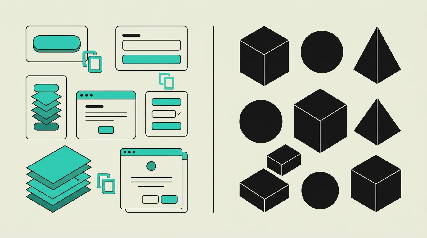
shadcn/ui
Not a traditional component library but a curated collection of reusable components you copy directly into your project via the CLI. Built on Radix UI primitives with Tailwind CSS styling and CSS variables for theming. You fully own the source code, enabling unlimited customization without dependency lock-in. Components follow consistent design patterns and are optimized for React 19 and Next.js 16, including Server Component compatibility where applicable. With over 70,000 GitHub stars, shadcn/ui has become the default starting point for new React projects.
Radix UI
A low-level, completely unstyled component library focused exclusively on accessibility and interaction behavior. Radix provides WAI-ARIA-compliant primitives such as Dialog, Popover, Select, Tabs, and Tooltip without any visual styling. Developers retain complete control over the visual design while complex interaction patterns like focus management, keyboard navigation, and screen reader support are correctly implemented. Maintained by the WorkOS team, Radix is the most widely adopted headless UI library in the React ecosystem.
What are the key differences between shadcn/ui and Radix UI?
| Feature | shadcn/ui | Radix UI |
|---|---|---|
| Distribution model | Copy-paste via CLI (npx shadcn@latest add); code lives entirely in your project | npm package (@radix-ui/react-*); traditional dependency with version management via npm |
| Default styling | Fully styled components with Tailwind CSS, CSS variables, and built-in dark mode | Completely unstyled; you must add all styling yourself using your preferred CSS approach |
| Accessibility | Inherits WAI-ARIA compliance from underlying Radix primitives automatically | Excellent WAI-ARIA compliance with focus trapping, keyboard navigation, and screen reader labels |
| Customizability | Unlimited; you own the source code and can modify every aspect of styling and behavior | Limited to what the component API exposes; internal implementation details are not modifiable |
| Maintenance & updates | Manual; you must apply upstream changes yourself to copied component files | Automatic via npm version updates with semver-based breaking change warnings |
| Theming | CSS variables with built-in dark mode; multiple theme presets available through CLI | No theming system; styling is entirely the responsibility of the consuming developer |
| TypeScript support | Full TypeScript types that you can customize and extend to match your needs | Excellent TypeScript types with generic props and strictly typed event handlers |
| Bundle size | Only components you add are included; no unused code thanks to the copy-paste model | Tree-shakeable per primitive; minimal overhead from granular npm packages |
When to choose which?
Choose shadcn/ui when...
Choose shadcn/ui when you want an immediately beautiful, production-ready component library that you own and can customize fully. The copy-paste model means no version lock-in, and Tailwind CSS integration ensures consistency with your existing design tokens. The CLI makes adding components trivial: a single command generates a fully working component with correct accessibility baked in. Best for teams that value shipping speed without sacrificing control, accessibility, or the ability to deeply customize every component.
Choose Radix UI when...
Choose Radix UI directly when building a fully custom design system with a unique visual identity that differs substantially from the shadcn/ui aesthetic. The unstyled primitives give you complete freedom over appearance while handling complex accessibility patterns like focus management, keyboard navigation, and ARIA attributes. Also the right choice for multi-brand platforms where the same interaction layer must render with entirely different styles, or for enterprise teams wrapping Radix in an internal component library.
What is the verdict on shadcn/ui vs Radix UI?
shadcn/ui and Radix UI are complementary rather than competing: shadcn/ui is literally built on Radix primitives. The choice depends on how much you want to build yourself versus how much you want ready-made. shadcn/ui gives you a beautiful, working UI that you can fully customize from day one, while Radix UI provides the perfect foundation when building a custom design system with a unique visual identity from scratch. For most projects, shadcn/ui is the fastest path to a professional interface. Radix becomes the better choice when supporting multiple brands or fundamentally different designs that share the same interaction layer.
Which option does MG Software recommend?
At MG Software, shadcn/ui is our standard component library for new React and Next.js projects. The combination of Radix primitives with Tailwind CSS delivers a perfect balance of development speed and customizability. The CLI makes adding components trivial and the CSS variables for theming integrate seamlessly into our design workflow. We use Radix UI directly only when clients need a fully bespoke design system that fundamentally deviates from shadcn/ui patterns, or when multiple brands must be served from the same codebase with entirely different visual identities.
Migrating: what to consider?
Migrating from a custom Radix UI implementation to shadcn/ui is relatively straightforward because shadcn/ui uses the same Radix primitives under the hood. Copy shadcn/ui components into your project and adapt the Tailwind classes to match your design tokens. Existing Radix logic and event handlers remain intact. Migrating in the opposite direction, from shadcn/ui to direct Radix, requires stripping the Tailwind styling and rebuilding the visual layer. Plan two to four weeks for a full migration depending on the number of components in use.
Frequently asked questions
We build production software with this stack
Our developers work with these tools daily for clients across Europe. Price estimate within 24 hours.
Discuss your project